
Wireframing My App Idea in Figma
I opened Figma for the first time not knowing what to expect. This post walks through how I wireframed my first app idea, the challenges I faced, and the lessons that’ll shape my next designs.

Use the links below to jump to specific sections of the post
Overview ● Inspo ● Goal ● DesignProcess ● Reflection
Pair & Pour
Overview
Created a wireframe for an app that provides you with a charcuterie & wine or meal and wine pairing. This was my first time creating a wireframe and overall I had a great time. I want to use this space to reflect on learning a new tool and the intention and thought behind the design of my wireframe.
Inspiration
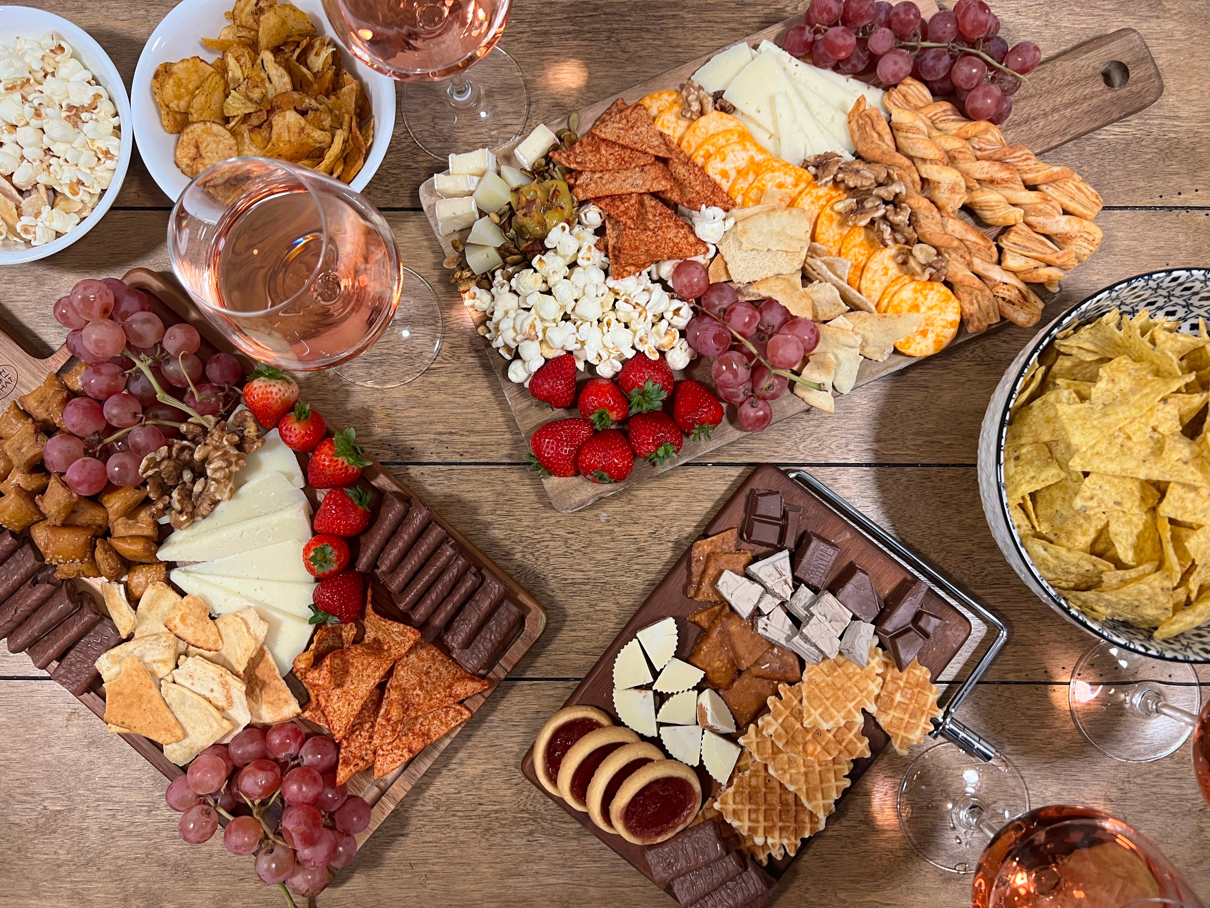
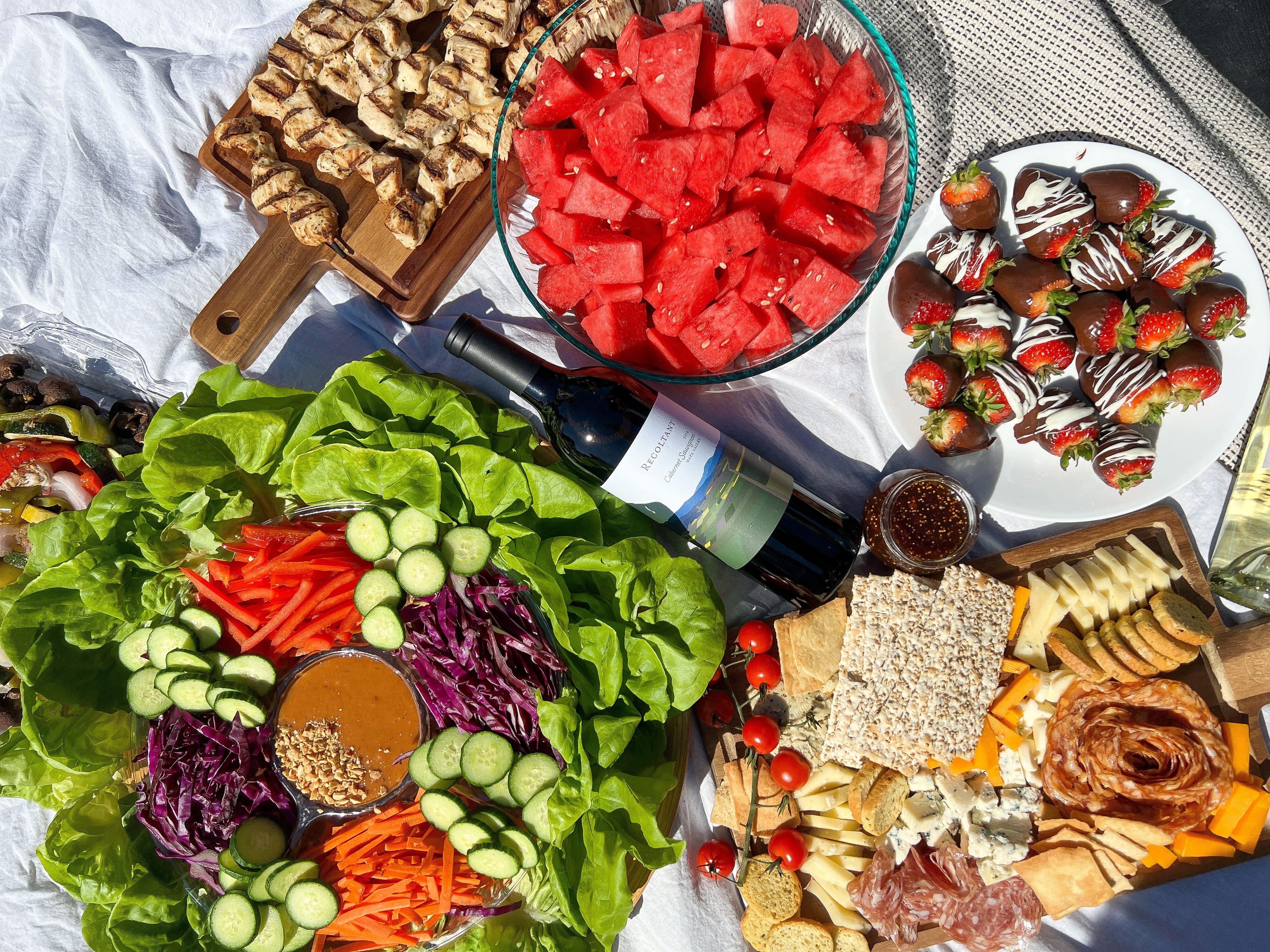
I’ve always loved creating a space where friends can connect over good food, laughter, and shared moments. For me, that often looks like hosting and getting people together for events like movie premieres, Galentine’s Day, or spontaneous picnics in the park (especially now that I live in San Francisco, where park culture thrives). Whenever I host, I make sure there are great snacks and great drinks.
When I first moved here, I didn’t know a single person. As I slowly made new friends, I noticed that not many of them enjoyed wine as much as the friends I had back home. This surprised me, especially being so close to Napa. But after enough hangouts, that started to change. I like to think it's because of my low key mission to prove people wrong when they say they don’t like wine. I think it’s just a matter of finding the right wine because there’s such a wide range of flavors and styles out there. I’ll usually ask a few questions about their taste preferences and keep that in mind for the next time we meet. Whether I’m bringing a bottle to the park or preparing a small board at home, I always try to tailor the experience and sway their stance.
That personal matchmaking of flavor and vibe became the inspiration behind this project.
Scope & Goal
The primary goal of this project was to get hands on practice with Figma and begin exploring the fundamentals of UI/UX design.
While I didn’t conduct extensive market research, the focus was on translating a casual idea into a wireframe to experiment with layout, structure, and user flow. My goal was to make design decisions, problem solve, and build confidence using Figma.
Wireframe
My Design Process
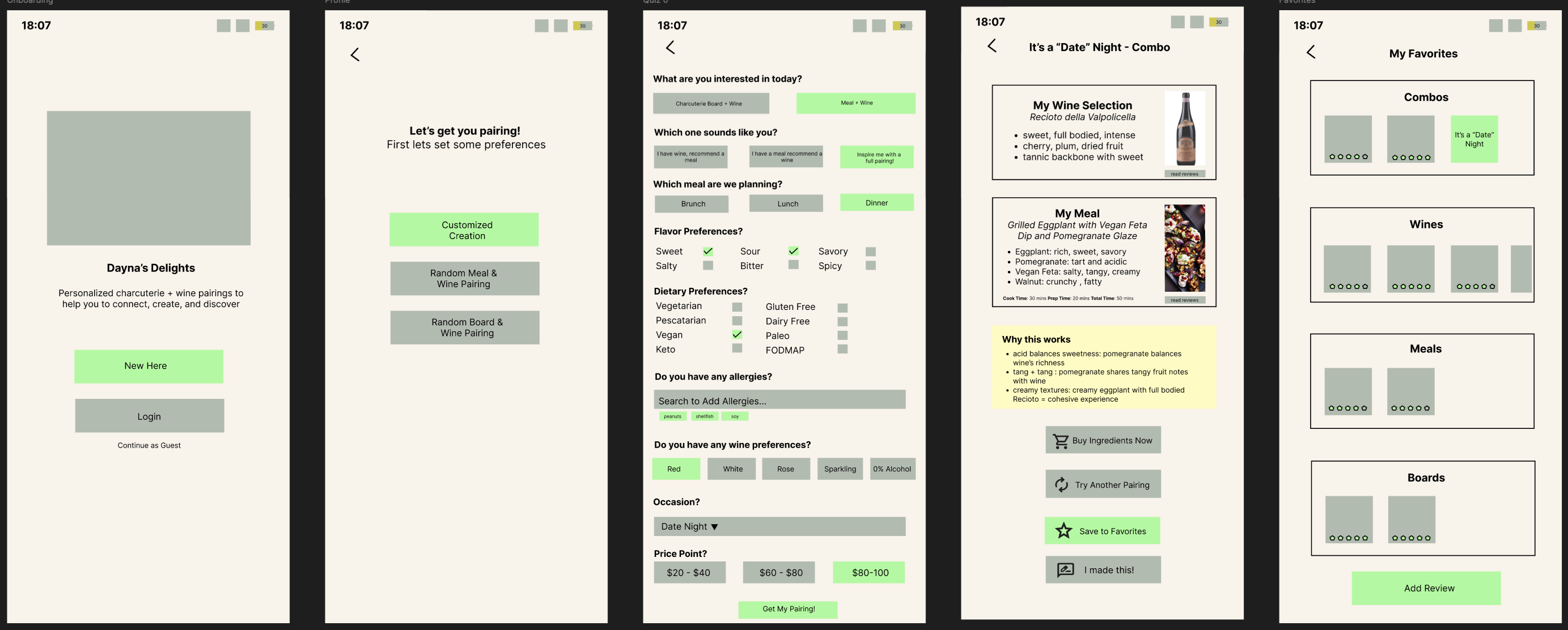
I began the wireframe by instinctively creating an onboarding page because its a natural starting point to welcome users and set expectations.
Next, because I ask my friends about their tastes in real life, I designed a preferences page. Here, I focused on using a quiz to gather key information like budget, dietary needs, and flavor preferences to ensure the app could tailor recommendations to all aspects of a user’s lifestyle.
Following that came the results page, where I aimed for a clean, simple layout highlighting both the wine and the charcuterie board pairing. While designing this, I realized there are countless variations of charcuterie boards, just swapping one ingredient could change the experience. This insight led me to expand the concept to include meal pairings alongside boards, which felt easier to work with.
Originally, I hadn’t planned on having a recipes section because charcuterie boards are usually the placement of ingredients together and does not require actual cooking, but since meals require recipes, I would want a recipe view where users can see recipe and reviews and get full ingredient list. To make it practical, I included a “Buy Now” button so users could quickly source ingredients. For those new to wine and food pairing, I also wanted to explain why a particular meal and wine go well together.
Personalization is important so I designed a save feature so users could bookmark favorite recipes or pairings. I toyed with the idea of letting users modify recipes and save their custom versions, but decided to keep it simple for this first iteration. Instead, I added an “I Made This” button which ideally would track what they’ve tried and enable them to customize and save the recipe.
I also created a favorites page, a straightforward space to revisit saved pairings, inspired by the common design pattern I see in many apps.
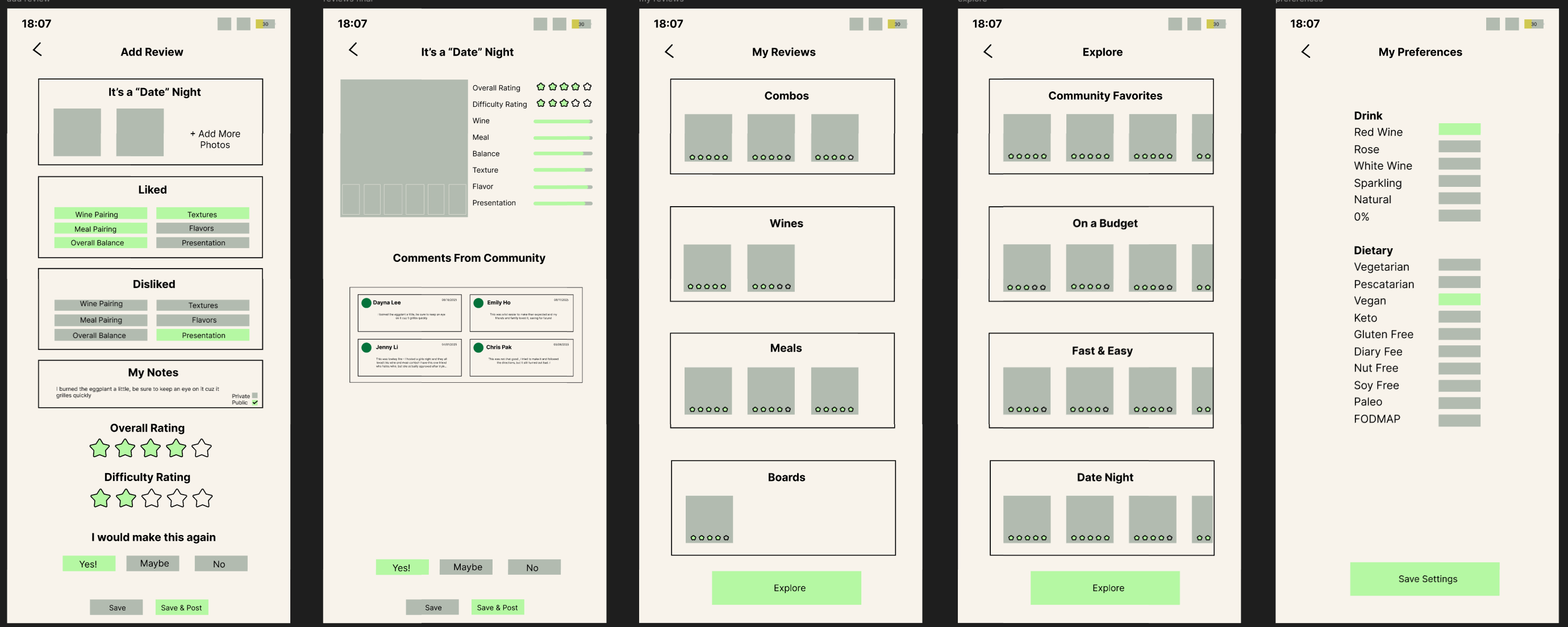
Next, I built a review page, which felt essential since I enjoy writing reviews myself. But beyond letting users write their own reviews, I wanted them to see feedback from other users. I personally , heavily rely on reviews when making decisions. This resulted in the creation of a community to share with. For the community view I wanted to show an overall rating and individual users reviews.
Sharing wine and food brings people together so I added an explore page to foster a sense of community where users can discover popular pairings, photos, and notes shared by others.
Lastly, I know I often times cook for others, but have different dietary preferences myself, so even though they’d taken the initial quiz, I added a settings/preferences page to let them update or adjust their personal tastes as needed.
Reflection
This was my first project using Figma, and it helped me become more comfortable with the tool while introducing me to deeper levels of UX/UI thinking. I started paying attention to design details I’d never considered before like what colors appeal most to Gen Z vs Millennials and the pages needed to navigate through a simple app.
Throughout the process, I ran into a few key challenges:
Missing Screens & Flow Gaps
I noticed I hadn’t yet designed certain pages that would be essential for users to fully engage with the app, like a personal recipe book or the ability to save modifications.
Sourcing Real Data
Figuring out how to source recipes, link to stores, and integrate live pricing for ingredients presented major technical hurdles. I’d also need to think through how to properly credit recipe creators.
Review System Complexity
Originally, I envisioned users reviewing individual wines, meals, charcuterie boards, and combo pairings. But I quickly realized reviews could become fragmented, making it harder for users to gauge the value of a pairing. I’d need to consolidate or cross-link reviews in a way that’s still helpful and relevant.
Privacy & Personalization
In future iterations, I’d love to include a privacy toggle so users can keep pairings and notes to themselves. I’d also want to let users modify existing recipes and save those changes. This is especially helpful for people with dietary restrictions or evolving preferences. As someone who’s been vegan, pescatarian, lactose-free, and vegetarian at different points in my life, this kind of flexibility feels essential.
This project gave me a solid foundation in both Figma and product thinking. It also sparked my next idea: an app that suggests one single place to eat based on mood and preferences with the intention of cutting through decision fatigue and saving users from endlessly scrolling through restaurants.